HIStalk’s Must See Vendors – MGMA 2011
3M Health Information Systems
Booth 1300
3M Health Information Systems delivers software and consulting services to help organizations improve compliance, workflow efficiency and financial performance. We offer expertise in clinical documentation, remote and automated coding, ICD-10, dictation, speech recognition, and mobile physician technology to support the electronic health record and pay for performance initiatives.
Acusis
Booth 1400
Acusis provides cost-effective, accurate outsourced clinical documentation solutions to hospitals, clinics, and physician practices. AcuSuite, Acusis’ web-based software application, manages the entire process and delivers meaningful clinical documentation within a tailored turnaround time of 24 hours or less while providing Higher Standards, seamless implementation, EMR integration, and highest customer satisfaction.
ADP AdvancedMD
Booth 559
AdvancedMD is now part of ADP, a trusted company with $10B in revenues and 570,000 clients, including 45,000 physicians. The company provides cloud EHR and leading billing tools. Proprietary claims scrubbing produces 95%+ first-pass acceptance compared to the industry average of 70%. Clients receive automatic and offsite backup, as well as continuous updates to meet regulatory compliance.

Allscripts
Booth 1317
Allscripts provides innovative solutions that enable a connected healthcare community. More than 180,000 physicians, 1,500 hospitals and 10,000 post acute care organizations trust Allscripts to improve patient care and deliver world-class outcomes. Check out our Client Outcomes Center at www.allscripts.com/i2o to learn more.
Allscripts Partner Booth Bingo
VISIT Allscripts (BOOTH 1317) OR ANY OF OUR Featured Partners DURING MGMA TO PICK UP YOUR BINGO CARD. Collect stamps AT ALL PARTICIAPTING BOOTHS and you could win ONE OF SEVERAL GREAT PRIZES! LIVE DRAWING IS TUESDAY AT 1:00PM AT ALLSCRIPTS BOOTH 1317.
No purchase necessary, open to MGMA Annual Conference attendee members only (sorry, no vendors). Game ends at 1:00PM on Tuesday, October 25, 2011. You must be present to win.

AT&T
Booth 1643
AT&T ForHealth is a new area that will accelerate delivery of innovative wireless, cloud-based networking services and applications. AT&T believes that the use of technology and smart networks will help improve care quality and reduce costs for a healthier world. AT&T Inc. is a global leader in communications.
Capario, Inc.
Booth 117
Capario provides revenue cycle management solutions that accelerate and refine critical reimbursement processing needs, including real-time transactions, electronic payer remittances, denial management and business-intelligence reporting. To learn more, visit www.capario.com.

Culbert Healthcare Solutions Inc
Booth 1328
Culbert Healthcare Solutions is a professional services firm serving healthcare organizations. We specialize in helping group practices leverage clinical and practice management technologies to improve patient care and financial performance by implementing best practices. Stop by to find out how to win an Apple iPad2.
eClinicalWorks
Booth 1145
eClinicalWorks provides ambulatory clinical solutions, including EMR/PM software, patient portals and community health records applications. With 55,000+ providers and 250,000+ medical professionals across all 50 states using its solutions, customers include small, medium and large physician practices, out-patient departments of hospitals, health centers, departments of health and convenient care clinics.

Emdeon
Booth 1301
Emdeon is a leading provider of revenue and payment cycle solutions that connect payers, providers and patients to integrate and automate key business and administrative functions throughout the patient encounter. Stop by the booth to find out how to win a vacation on Emdeon!

e-MDs
Booth 1728
Visit e-MDs at Booth #1728 to demo the new e-MDs Rounds® for the iPhone. The user friendly mobile app combines the power of e-MDs Solution Series™ with the mobility of an iPhone, allowing doctors to remotely and securely key in patient information from their EHRs via their mobile device. Using Rounds®, doctors are able to view patient data and scheduling information, capture charges, view results, write prescriptions, and exchange messages internally with staff.

Enovate
Booth 642
Enovate is a national provider of mobile and wall mounted clinical workstations for the healthcare environment. Enovate provides multiple solutions for medication delivery, computerized physician order entry, clinical documentation, and electronic medical records. Enovate – advancing health information technology For more information, call (877)258-8030 or visit www.enovateusa.com.

Gateway EDI, LLC
Booth 717
Gateway EDI, a health care electronic data interchange provider, helps practices maximize revenue, increase cash flow and catch claims issues before they impact a practice. Over 90,000 physicians trust Gateway EDI to take the worry out of billing, so they can focus on patient care. For information, visit www.gatewayedi.com.

GE Healthcare IT
Booth 501
GE Healthcare provides transformational medical technologies and services that are shaping a new age of patient care. Our Centricity solutions support the vast information needs of our customers with enterprise-wide and departmental clinical systems; industry-leading imaging management solutions and best in class practice and revenue cycle management tools.

Greenway Medical Technologies
Booth 517
Greenway Medical Technologies provides innovative EHR, ambulatory healthcare and clinical research business solutions to more than 33,000 healthcare providers nationwide, in 30 specialties, by enhancing the delivery of patient care through advanced health IT software and on-demand services that allow physician practices to function at their highest level of efficiency.

Kareo
Booth 1716
Kareo – an MGMA "newbie" but a veteran in making medical billing software easy to purchase, learn and use. Kareo’s web-based software powers thousands of small medical practices in the U.S. We are leading our industry in the shift from traditional software to cloud computing (a.k.a. Software-as-a-Service) with the sole aim of helping doctors get paid by taking today’s complex healthcare system and making it easy. This allows doctors to spend less time worrying about their business and more time caring for patients and saving lives. Visit Kareo @ booth 1716 and learn more about their refreshing and smart way to manage scheduling, eligibility, claims processing, patient billing and complement an EHR strategy.

Ingenious Med
Booth 1609
Ingenious Med is an industry-leading mobile platform optimizing healthcare performance and revenue. The application automates the activities of physicians through charge capture, documentation, coding and compliance, improved quality of care and digital communication. With more than 9,000 users in 800 facilities nationwide, the award-winning functionality optimizes performance, efficiency and revenue.
Lippincott Williams & Wilkins/Wolters Kluwer Health
Booth 200
Lippincott Williams & Wilkins, a Wolters Kluwer Health company is a leading international publisher of medical books, journals, and electronic media. Visit booth #200 to browse our comprehensive product line and learn about the fastest, most affordable evidence-based tool at the point-of-care, 5minuteconsult.com.
MedAssets
Booth 935
MedAssets works with healthcare providers to improve financial and operational performance. MedAssets further enables customers to deliver high quality, affordable healthcare through a comprehensive suite of evidence-based technologies and services, and developing best-practice solutions that effectively optimize revenue, secure reimbursement, reduce waste and aggressively manage total costs.
Medicomp Systems
Booth 459
Medicomp is an inventor of tools that enable clinical usability at the point of care. The MEDCIN and Quippe clinical knowledge engines and components are used daily by more than 100,000 clinicians to improve patient care, documentation, and compliance. Our tools provide actionable, patient-specific, problem-oriented views of all clinical data for a patient. For more information, visit www.medicomp.com.
MediServe
To schedule a meeting:
David C. Erickson
VP & GM
MediServe
480.299.3416
Davide@Mediserve.com
MediServe is a software development company dedicated exclusively to rehabilitation and respiratory care providers.

McKesson
Booth 725
McKesson delivers solutions across all care settings; providing physicians with more products, services, and resources than any other healthcare company including revenue management and practice management solutions as well as ONC/ATCB certified EHR systems for meaningful use. See how our solutions can prepare you for ANSI 5010 and meaningful use.
MED3OOO
Booth 1109
MED3OOO, healthcare management and information technology, offers solutions for medical practices, clinics, hospital systems and hospital-employed physicians with RCM, ASP PM/EHR systems, and ACO strategies. Visit our booth for a demonstration of our intuitive browser-based InteGreat EHR, enhanced with Quippe®, creating the first “EHR with Physician Intuition," and allowing physicians to create templates on-the-fly.
MED3OOO will be giving away 100 ipads to those who “win” a spot at one of 11 demo sessions held during the following times:
· Sunday: 2, 3, 4 pm
· Monday: 10, 11, 12, 3, & 4
· Tuesday: 10, 11, 12

MedAptus
Booth 1401
With the most powerful yet easy-to-use Intelligent Charge Capture technologies available, MedAptus enjoys enterprisewide adoption at many prestigious, academic healthcare organizations. Our full-scale Professional and Facility offerings increase revenue, re-engineer archaic processes, enhance EMR investments and save busy providers time.

Medicity
Booth 617
Medicity created iNexx to give physician practices the flexibility to select and download low-cost, certified EHR modules and other apps that fulfill meaningful use requirements and solve the practice’s specific workflow challenges – all within a professional social network that powers unprecedented patient-centered care collaboration.

NextGen Healthcare
Booth 1035
NextGen Healthcare is a leading provider of integrated electronic health record and practice management systems, connectivity solutions, and billing services designed to serve the needs of ambulatory practices and hospitals of all sizes and specialty areas. Our award-winning, certified solutions help improve care quality and increase operational efficiencies.
NextGen is also participating in the following sessions:
Healthcare Innovations Pavilion Education Session
Session HIP8: Capitalizing on PQRS as a Stepping Stone Toward Accountable Care
Monday, Oct. 24, 9:45-10:05 am
Lora Baker, manager, PCMH/ACO/PACE products, NextGen Healthcare
Concurrent Session
E4: Using Data and Leadership Alignment to Achieve PCMH Recognition
Tuesday, Oct. 25, 1:45-3:00 pm
Jen Barrera, SVP, Strategic Development and Dr. Tamarah Duperval-Brownlee, M.D., MPH, FAAFP, Chief Medical Officer, both from Lone Star Circle of Care, Georgetown, Texas

Nuance
Booth 1527
Nuance’s Dragon Medical is the most widely used speech recognition system in medicine today. Dragon Medical reduces transcription expense, delivers results rapidly, and heightens clinician satisfaction by making EHR systems easy to use, which accelerates the adoption of clinical information systems so provider organizations maximize the return from IT investments.
Practice Fusion
To schedule a meeting:
Liz Meyerdirk
Senior Director of Business Development
lmeyerdirk@practicefusion.com
415-992-5578

Sage
Booth 1116
Sage provides end-to-end clinical and financial technology solutions so physicians and medical professionals can focus on patients instead of paperwork. Serving more than 400,000 healthcare professionals including 80,000 physicians, Sage is physician-focused, patient-centric. To learn more about Sage solutions for EHR, practice management, patient engagement and reporting, call (877) 932-6301.

SRSsoft
Booth 1200
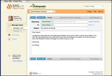
Leader in productivity-enhancing EHR technology for high-performance specialty practices—with a successful adoption rate unparalleled in the industry. Offered via the Unified Desktop™, the robust SRS EHR, SRS CareTracker PM, and SRS PACS increase speed and efficiency, free physicians’ time, boost revenue, slash overhead, and enhance patient care and satisfaction.
ZirMed
Booth 635
ZirMed is a nationally recognized leader in delivering revenue cycle management solutions to over 100,000 healthcare providers. ZirMed leverages the power of technology to cure administrative burdens and increase cash flow. ZirMed solutions include eligibility verification, credit/debit/check processing, claims management, electronic remittance advice, patient statements, e-commerce, and lock box services.







The article about Pediatric Associates in CA has a nugget with a potentially outsized impact: the implication that VFC vaccines…